


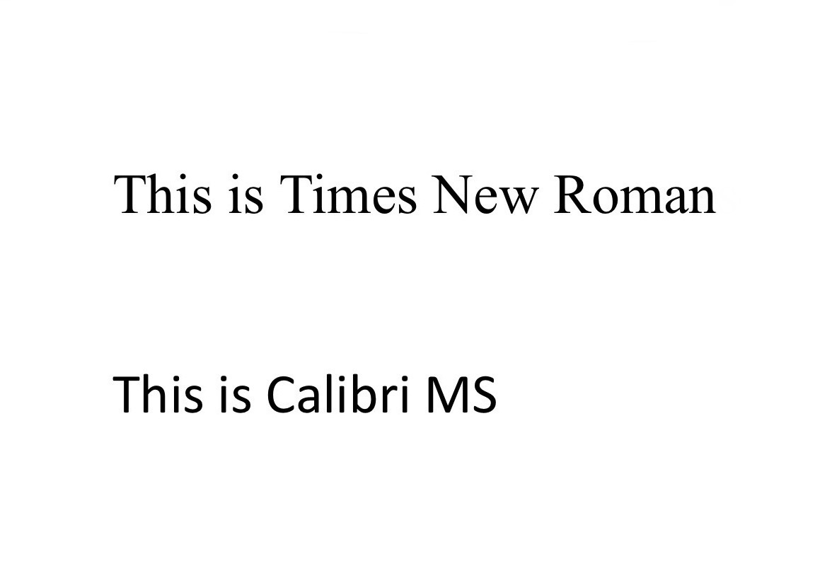


In 2023, the U.S. Department of State said they intended to transition out of Times New Roman and into Calibri. The purpose of this move was to help people with visual impairments read official documents. The change was implemented on Feb. 6, 2023.
In 2025, Secretary of State Marco Rubio reversed this directive in a memo called “Return to Tradition.”
“Switching to Calibri achieved nothing except the degradation of the Department’s official correspondence,” Rubio wrote. “So, to restore decorum and professionalism to the Department’s written work products and abolish yet another wasteful DEIA program, the Department is returning to Times New Roman as its standard typeface.”
While the primary reason cited for the reversal was professionalism, it’s important to consider the efforts that are being made in the background to cut accessibility programs throughout the country. While some of these cuts may not seem like a big deal, over time, all of these small cuts will add up.
Despite the recent prevalence of this issue, both Times New Roman and Calibri have been around for many years, and this debate is nothing new.
Times New Roman was designed by Stanley Morison in 1929 with the help of Victor Lardent for The Times, a London newspaper.
Times New Roman was more efficient for a variety of reasons, one being the introduction of the x-height, which standardizes the distance between the baseline and the top of the lowercase letter. This was an improvement because it made the font look more cohesive and professional.
Morison also condensed and boldened the typeface, which used more ink, but it let publications print more characters per page.
Calibri was designed by Lucas de Groot for Microsoft. It became the default Microsoft Office font in 2007, the year of the font’s release.
Calibri remained Microsoft’s default font until mid 2023, when it was replaced by Aptos.
While fonts have become something that people consciously tune out, subconsciously, the brain makes judgments based on fonts every time it consumes media.
“Our brains work super fast,” AP Psychology teacher Susan Spolarich said. “It will know if something is easy to process, especially with something visual like a font.”
Although a font may look legible to one person, others might struggle reading the same font.
“If you think about, like for example, people with dyslexia will perceive one font differently than another,” Spolarich said. “Cursive may be harder to process to some than others. If a font is too overwhelming, it can be harder to process.”
The consensus at Del Val is that Times New Roman is the more professional, legible font.
Students weren’t the only ones with strong opinions.
At the end of the day, font choice plays a huge role in communication in the digital age. It leaves an impression on viewers, whether they realize it or not.
While Calibri is a simple sans serif designed to be easier to read on screen, Times New Roman is familiar and comforting to readers and writers alike.
“I think [font selection] matters because there’s a feeling that goes into the fonts — there’s a comfort that’s sort of instilled in the consumer,” Perricone said.